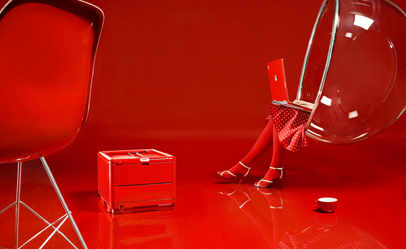
OKI, Lose grey – Love colour.
New position through product changes.
How do you market a product that is basically a grey box that prints out paper and that costs a bit more than other printers with the same specifications? OKI was facing just this challenge. We helped OKI transform the ordinary grey printer into a design product and made it possible for customers to choose just the right colour for their taste and personality. We set a new agenda and showed good style rather than features. By changing the product and getting in to new stores and press we changed the OKI brand.
New positioning strategy
OKI needed to market their newest colour printer for office use. Even though the printer was more powerful, cheaper and better than its predecessor, the difference was hard to see. OKI’s new colour printer was just yet another.
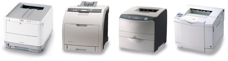
Easy to see why it’s hard to tell the difference.
It was not enough to tell distributors and customers that they were launching a new model. OKI asked Stagis to help market the small office colour printer in the Nordics. A difficult task when what you need is to stand out in the market, make a distinct product that differs and which people can still recognize and use. How could a single product change the corporate image of OKI?
New positioning strategies
We needed to come up with other competitive parameters than technical factors such as price, quality, endurance and number of colours. We mapped eight possible strategies within the four parameters; economy, usage, context and display. We wanted to develop a positioning strategy that made it possible for both the OKI brand and the specific model to stand out in a new and innovative way.
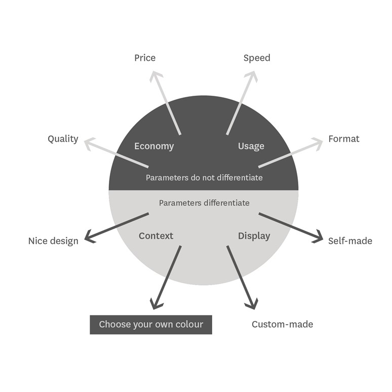
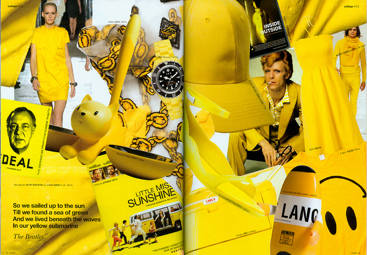
The new position we proposed was all about identity – we wanted to make OKI stand out by focusing on context and style.
Transforming the product
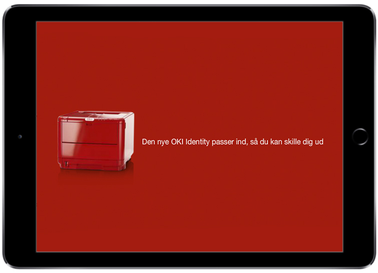
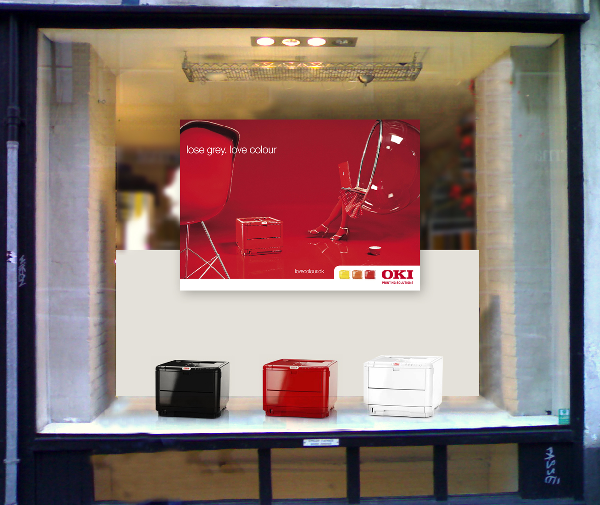
Focusing on style and context we made two different scenarios. We could either introduce custom-made printers with personal self-chosen pictures printed on the side of the printer, or we could launch a wide range of printers in different colours. We decided on the last scenario and developed the pay off “Lose grey – Love colour”. It was all about colours. Suddenly the colours were not only inside the printer but also on the outside.
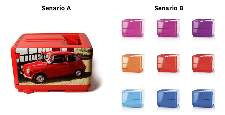
The two different scenarios: A printer with the customers own imagery vs. a coloured printer.
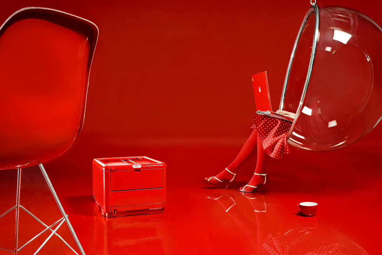
When Stagis pulled the idea out of the box about changing the colour of our printer it definitely was an eye opener. First of all we could see that the printer was extremely attractive. The gloss was just beautiful. We could still tell that it was our printer, only it was Farrari red all over. Lars Hargaard
Marketing Director, Northern Europe, OKI Printing Solutions
Producing the new printers
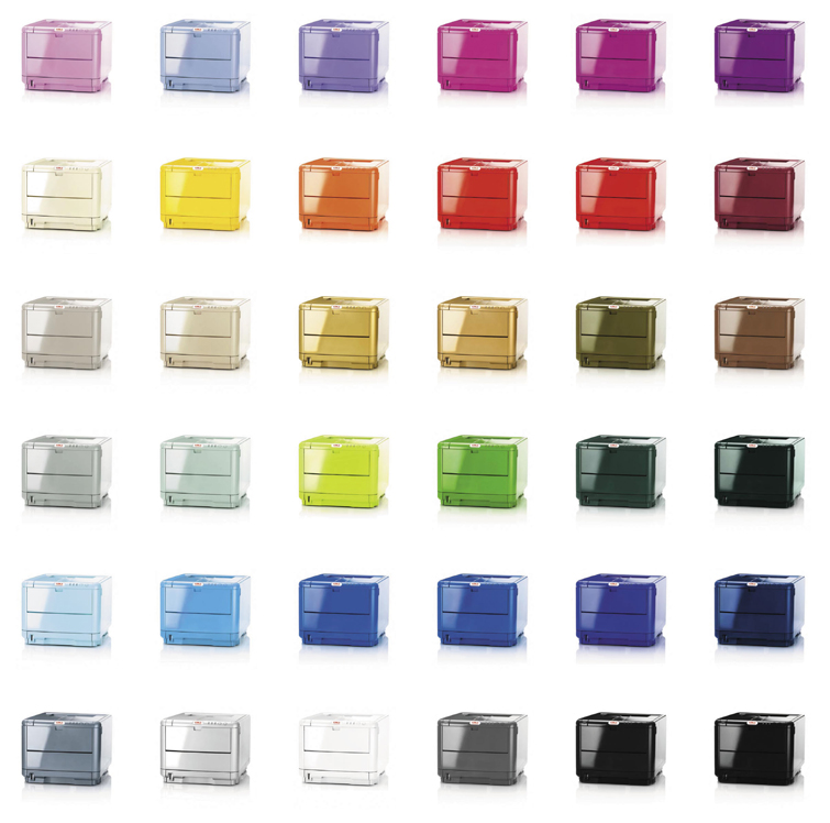
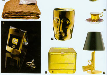
Stagis managed the entire process regarding changing the colour of the new printers. We administered the technical tests, the disassembling of the printer, the paint coating, and the assembling and packaging of 500 printers. Furthermore, we developed and produced stickers and a new brochure with care instructions. and launched OKI Identity in 36 different colours.
We wanted to create a wide range of colours so customers could choose just the right colour for their personality or the colour that would fit perfectly into their office. Nikolaj Stagis
CEO Stagis A/S
Colourful campaign website
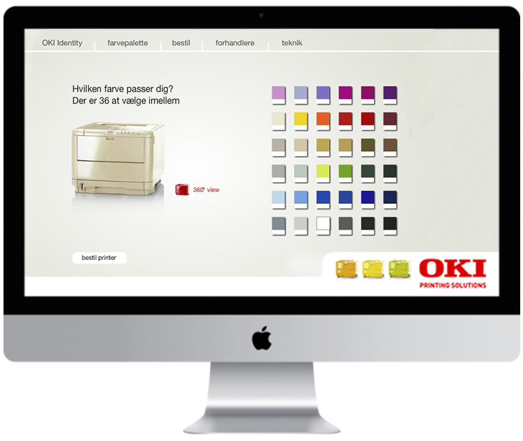
As a part of the project we developed a ”lovelolour” campaign website where the 36 unique colours were displayed. From Minty Green and Opera Blue to Ferrari Red and Power Pink. Also, customers could see a unique 360-degree view of the printer. They could find retailers and order their new colour printer. The website was designed so that the colour of the background changed automatically with gradual transition showing the different colours and supporting the overall strategy.
Communicating in new arenas
We managed to get the printer displayed and sold in leading trend and interior shops in Oslo, Göteborg, Stockholm, Copenhagen and Aarhus. By launching the printer in a wide range of colours we achieved a lot of valuable and positive publicity in fashion, trend and interior magazines – media that not usually mention printers and IT. “OKI Identity” was displayed in the Danish magazines Euroman, Cover and Bo Bedre and in similar Swedish and Norwegian media. Afterwards, the concept and product was mentioned in tech and business media. The press coverage helped transform the perception of the OKI brand, and OKI’s position in the market changed from being a boring and almost unknown supplier to become an innovative brand.
Positioning and sales effects
All of the 500 OKI Identity printers were sold. Not only did the project attract external publicity unseen in the printer market, but it also affected the self-perception and internal pride, strengthening the organization's motivation. The perception of the OKI image changed, and showed effect in the large corporate customer segment. The OKI brand was now perceived as ”innovative” and ”creative” by the corporate customers buying the largest business printers.
Transform your brand
Would you like to know more about developing a distinct visual expression and positioning the brand? Meet us for a cup of coffee and we will give you our honest opinion on the possibilities for strengthening your brand and business. Give us a call or write an email to Nikolaj Stagis. We can help you delvelop a positioning strategy and visual expression that attract customer's attention.
Related cases
-
OKI Printing Solutions
We delivered the positioning strategy that differentiated OKI from its competitors. The ‘Lovecolour’ printers created positive publicity in fashion and interior magazines.
-
Hedeselskabet
Redefined brand purpose and a new visual image moved Hedeselskabet into an increasingly digital and collaborative society while upholding the 149 year-old history of the brand.