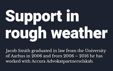
Visual identity for law firm supporting you in legal storms
The newly founded law firm, Smith Law needed to find their identity and differentiate themselves from other law firms. Smith law specializes in areas of restructuring and insolvency law, corporate and commercial law and litigation and arbitration. In other words, when the clients experience legal storms, Smith Law offer shelter from the rough weather. We developed the brand strategy and concept behind Smith Law’s new visual identity and created a design that expresses the brand and positions Smith Law in the market of legal services. Today Smith Law is a successful, growing business and the number of employees has increased.
Brand identity
The inherent strenths of a company are valuable when designing and positioning a brand. To identify the strengths of Smith Law, we carried out a mapping with the founder Jacob Smith and identified a number of strengths and qualities that characterize the law firm.
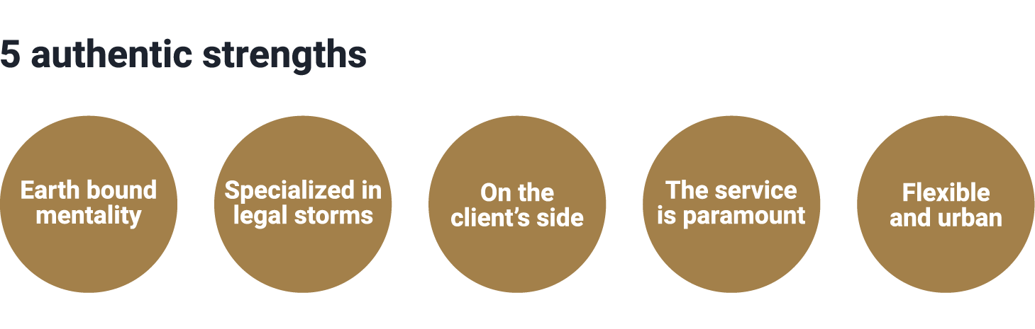
Jacob Smith is originally from Jutland, a region of Denmark known for having a fisherman’s or farmer’s mentality with both feet solid on the ground. The earthbound and calm approach is one of the strengths in Smith Law’s identity. At the same time Smith Law have a very modern and urban way of working. They are flexible and adapt to the client’s needs instead of having to do things “the way they have always been done”. Furthermore, Smith Law handle cases in a way that gives the client an experience of having the law firm on their side – which isn’t always the case with law firms.
Three scenarios for the brand
We developed three scenarios for the future brand and visual identity. Each of the scenarios combine different strengths and highlight different ways to express who Smith Law are and what they do.
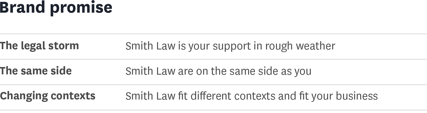
We decided to focus on the first of the three scenarios and have built a concept around the brand promise “Smith Law is your support in rough weather”.
Visual design
The concept of the scenario “the legal storm” illustrates that companies and organizations who are facing serious legal issues, such as a bankruptcy, litigation or restructuring, can put the matter safely in experienced and professional hands. The storm is a metaphor for the, sometimes overwhelming, situation in which the company may find itself. Smith Law is a helping hand that guides you safe to shore. The concept reflects the identified strength of being earth bound.
Logo
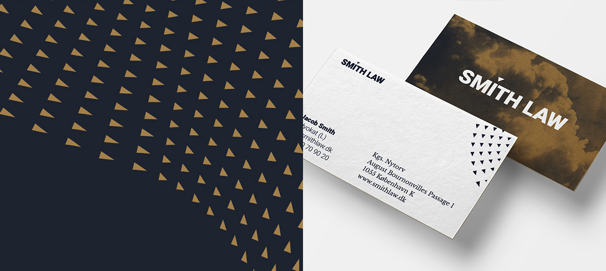
The logo is the simplest representation of the name and the qualities of the brand. The grounded strength of Smith Law is shown in the heavy design of the typeface and the triangle above the ‘i' represents the rough weather.
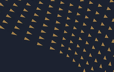
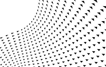
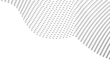
Fifth element in visual identity
The fifth element is a simplification and illustration of stormy weather. It is inspired by the graphics used in weather reports. It symbolises the movement of the storm and connects across all platforms.

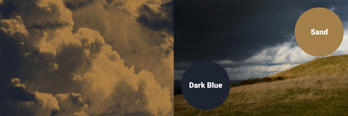
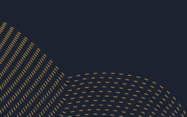
Earth bound and stormy colors
The colors have been chosen due to their resemblance to the the rough nature in the Western part of Jutland. The dark blue color illustrates a dark stormy sky and the sandy color is inspired from the sand dunes.

The storm
To illustrate that it is possible for Smith Law’s clients to get through the storm, we use photos of stormy weather, where the clear and sunny spots between the dark clouds symbolize the light on the other side of the storm. The color secures a relation to the rest of the identity.
Mixing robust and classic typography
The primary font is Heebo Black, which has been chosen due to its bombastic appearance and its ability to symbolize robustness that is able to withstand rough weather. Libre Baskerville has been chosen as the bodytext, as it has a classic design that fits well with the law profession.

Modern photos
To illustrate how the law firm is earthbound and unaffected by legal storms, the photographer Per Morten Abrahamsen created our very own storm by soaking Jacob Smith with a water cannon. The photos add a personal twist to the brand by representing a lawyer in a very untraditional way.
Expressing the brand with a fifth element
The fifth element is a series of graphic illustrations of the storm that makes it easy to recognize the brand. The illustrations can be varied and used in many ways, but are all inspired by the movement of wind and water in a storm.
Classic communication with a twist
We have implemented the visual identity on a series of different communication platforms. The front of the business card illustrates the rough weather. On the back Smith Law is unaffected by the rough weather. We also developed a line of stationary meant for legal documents. In these types of documents, the content is in focus. As a means to respect the content, we decided to turn down the intensity of the identity to create a more professional and serious expression.
Digital communication
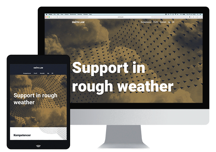
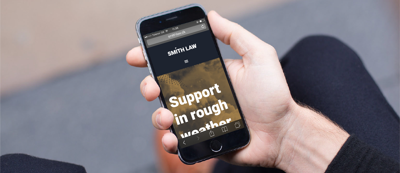
The corporate website is one of the few communication platforms a Danish law firm has. Smith Law's communication is aimed at businesses, which makes it essential for the website to be both professional and distinct. We developed a simple website that users can easily scrool through, but a site that differentiates from many other law firms, by using large photography and graphics, a narrow selection of color. The brand concept and the architecture of the websitequickly gives the user a clear understanding of the brand and makes sure that Smith Law differentiates itself from other law firms.
Transform your brand
Would you like to know more about positioning your brand digitally? Meet us for a cup of coffee and we will give you our honest opinion on the possibilities for strengthening your brand and business. Give us a call or write an email to Nikolaj Stagis. We can help you transform your brand digitally or communicate your strengths to attract customers.
Related cases
-
Hedeselskabet
Redefined brand purpose and a new visual image moved Hedeselskabet into an increasingly digital and collaborative society while upholding the 149 year-old history of the brand.
-

Copenhagen Business School
A careful tailored strategy and visual identity increased the public awareness of the program MMD and synergies between real life and digital experiences expressed the strengths of MMD.
-

OKI Printing Solutions
We delivered the positioning strategy that differentiated OKI from its competitors. The ‘Lovecolour’ printers created positive publicity in fashion and interior magazines.