Wedo is healthy food that fits you. We transformed the brand to fit the business.
Copenhagens no 1 chain of convenience salad shops needed to differentiate from other restaurants in the take-away market. We developed a brand strategy and a visual identity to clearly define and express Wedos identity. Wedo is a growing and successful business, tapping into the global healthy lifestyle trend.
Identity exploration
Creating a successful brand is all about exploring and focusing the inherent characteristics of a brands identity. Wedofood had grown out of being a catering business and had established three take-away restaurants focusing on greens.
Being among the first delivering a tasty experience of choosing your own healthy salad ingredients, Wedofood had growing potential. But the shops were messy, the messaging was a mix of odd ideas and the name carried the old company story about “food”. To understand the existing Wedofood authentic identity, we interviewed customers, employees and the founder of the business. We identified the authentic strengths of Wedofood and used them to develop the potential future scenarios for the brand. These statements of "who we are" is a platform to formulate strategy and the future purpose of the company.
- Scenario 1: Healthy + You decide
- Scenario 2: Healthy + Space for differences
- Scenario 3: Always care + Local and socially engaged
The owners chose scenario 1, focusing on “Healthy” and “You decide” as strategic guidance and to position the new brand in a growing and competitive convenience food market.
Focusing the brand
The most important factor about a brand, is the name. To keep continuity and yet energize the brand to a contemporary Nordic market, we shortened the name to “Wedo”. It leaves out the old story of “food” and feels more like a name.
Your brand name has to be simple. The experiences, space, visuality and sound around the name will build the associations in the minds of customers Nikolaj Stagis
CEO
We developed the core narrative, the brand values and described the most important factors to enhance, in order for the brand to stand out in the market.
Visual identity
Wedo’s visual identity brings the corporate brand to life. We created the new logo, typography, colors, photography style, shop signage and new packaging concept.
Because health is a big part of the new brand, it was important to bring it to live in the visual identity, so we created a color scheme to express the change of the seasons food.
Logo w leave shape
We designed the W mark to form a leaf to build the idea of greens into the brand name.
Logotype Wedo
The Wedo logotype is friendly and refers to a Nordic tradition of contemporary typography.
Logotype Wedo
The Wedo logotype is friendly and refers to a Nordic tradition of contemporary typography.
Logo in two colors
The logo works as a full colored mark in green or in a white (negative) shape on a dark background.
Logo in two colors, outlined shape
For some purposes such as signage and stickers on windows the outline of the logo is useful.
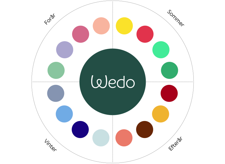
Healthy living and salads may be green. But vegetables and seasons are all about color. With a new color palet the Wedo brand communicates two things; We are connected to the time of year and we let you decide exactly how you want to compose your meal. By following the time of year in Wedos visual communication, the brand is always reflecting the ambience.
Headline green typography
The headline typography chosen is Branding Semibold. It gives a sense of Nordic elegance while being human and giving space for a bit of humor.
Typography yellow and white
For longer copy we chose Branding Semilight which fits well with the logotype and the overall aesthetics of the new Wedo brand.
Packaging design
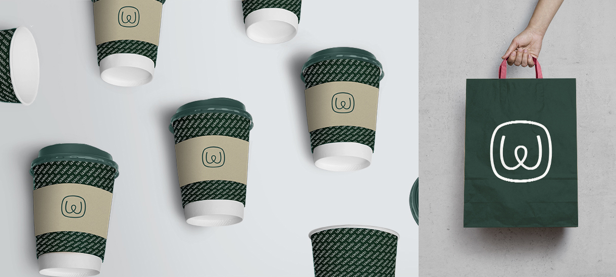
The brand experience is so much more than visual design. The journey through space, how the staff act and what they wear and how you navigate; from entering the door to sharing your meal or walking out the door with a paper bag.
We developed the over all packaging design and suggested small sparkles of humor and vivid color to spice up the brand experience. We wanted to balance the message of ”health” with a feeling of joy. For the basic introduction of the new brand we developed a style focused on the new name and logo. Later initiatives include copy that use the Wedo-name actively.
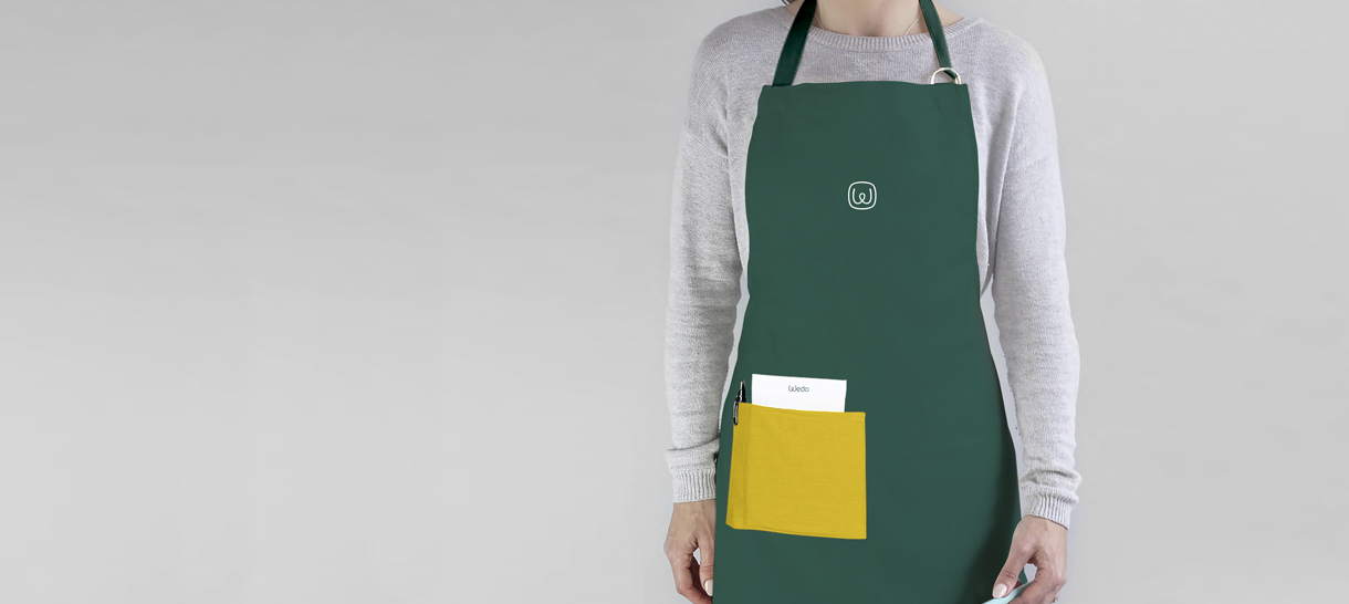
Mixing the green brand color with personal clothing and a touch of bright yellow, blue or pink helps the brand express both continuity and personality.
Shop communication
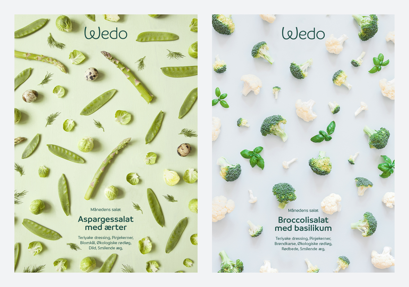
As a customer at Wedo, you decide. What you want in your dish, what ’healthy’ means to you and if you want to eat at the restaurant or at home. We developed an image concept that uses the ingredients isolated to construct colorful graphic patterns. Large format posters in the shop windows will communicate new unique combinations and reflect the time of year.
Our solution for shop signage varies from location to location, fitting the style of the architecture and expressing the brand in a unique way. Signs, foils and displays help communicate the new brand in a vibrant and modern way for each location.
Transform your brand
Would you like to know more about focusing your brand strategy and designing a distinct visual expression? Meet us for a cup of coffee and we will give you our honest opinion on the possibilities for strengthening your brand and business. Give us a call or write an email to Nikolaj Stagis. We can help you develop your strategic direction, express strengths or attract customers.
Related cases
-

Smith Law
Distinct visual identity and website with bold design differentiated the startup Smith Law from other law firms and positioned them successfully the market.
-
Hedeselskabet
Redefined brand purpose and a new visual image moved Hedeselskabet into an increasingly digital and collaborative society while upholding the 149 year-old history of the brand.
-

OKI Printing Solutions
We delivered the positioning strategy that differentiated OKI from its competitors. The ‘Lovecolour’ printers created positive publicity in fashion and interior magazines.